EVIDEA FLAGSHIP STORE
29 Ağustos 2019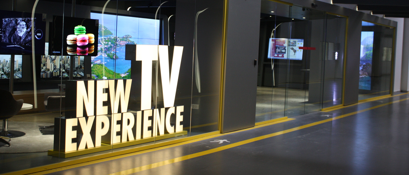
ARÇELİK TV EXPERIENCE SHOWROOM
TV experience showroom design in Çerkezköy campus of Arçelik is requested which will be functioning as a test room, display and presentation area.
LOCATION
ISTANBUL
YEAR
2018
CLIENTARÇELİK A.Ş.
TOTAL AREA
250 SQM
CATEGORY
RETAIL, SHOWROOM, ELECTRONICS
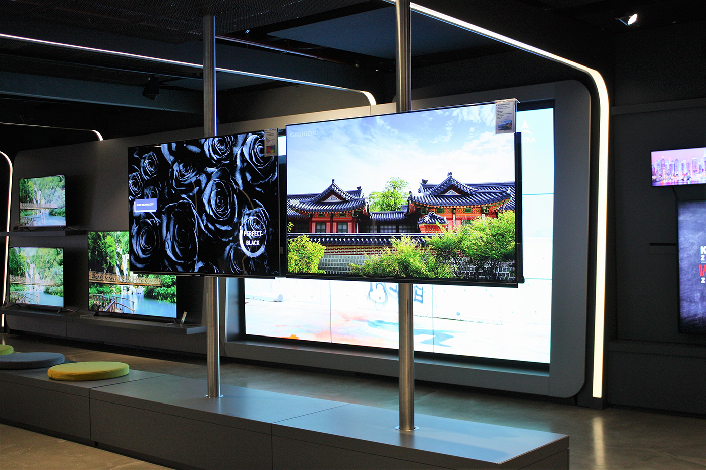
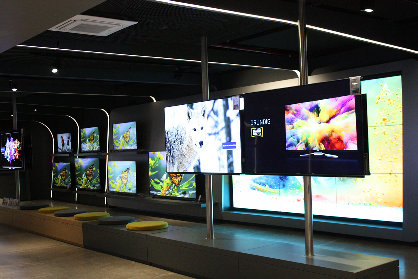
Arçelik, Grundig and Beko brand’s products will be displayed in showroom so our brief is to approach all three brands equally and design a space that none of brand is coming forward than others.
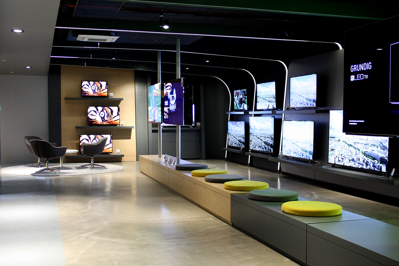
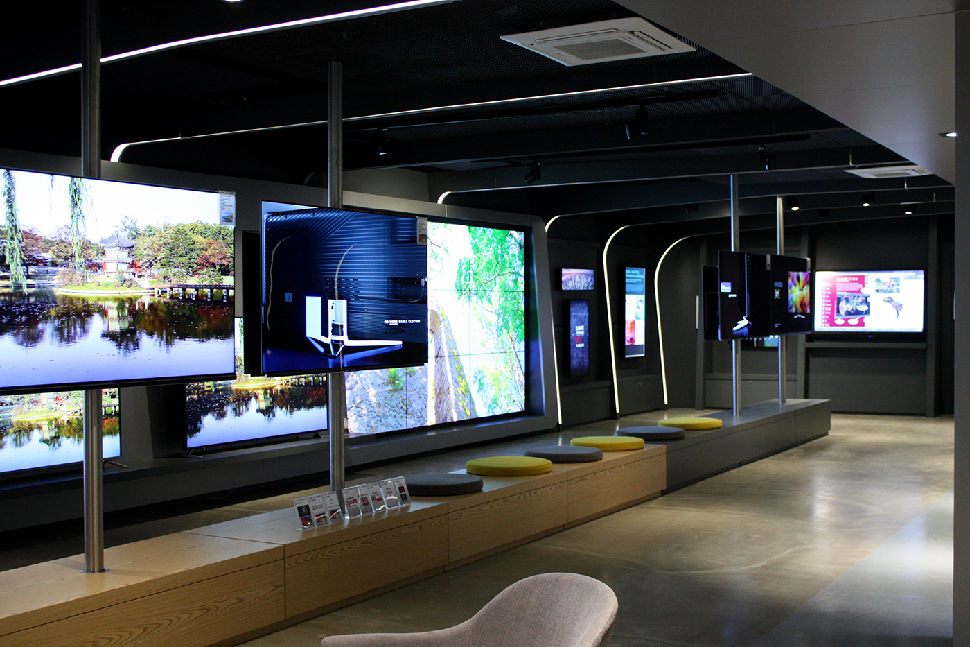
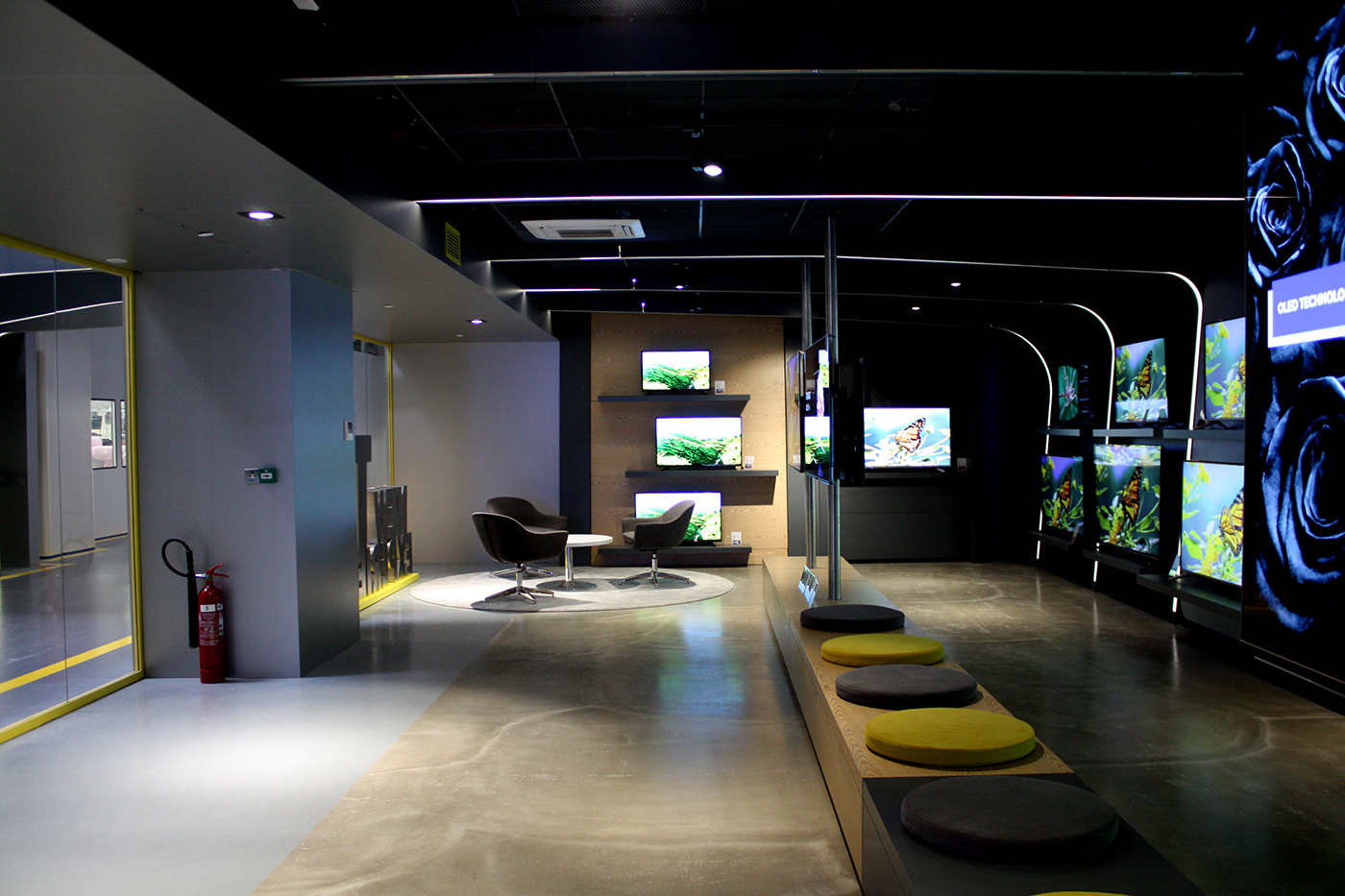
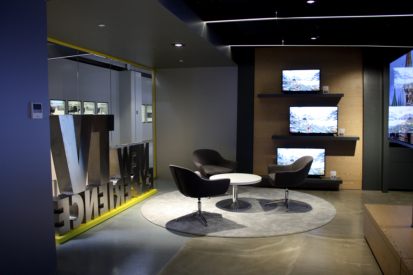
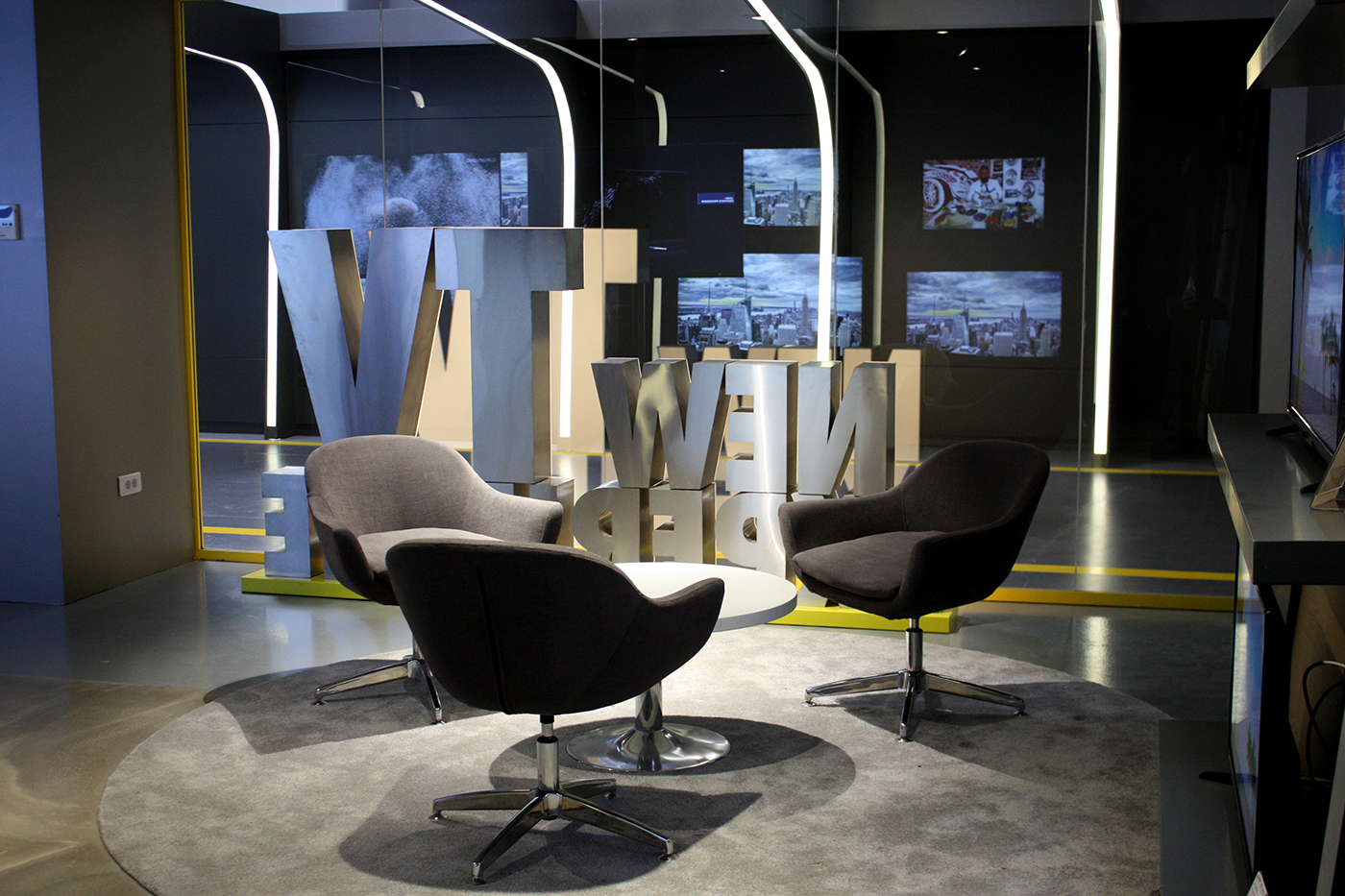
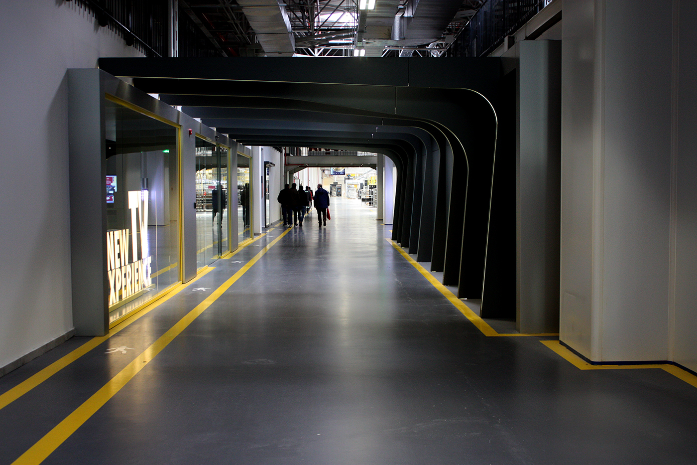
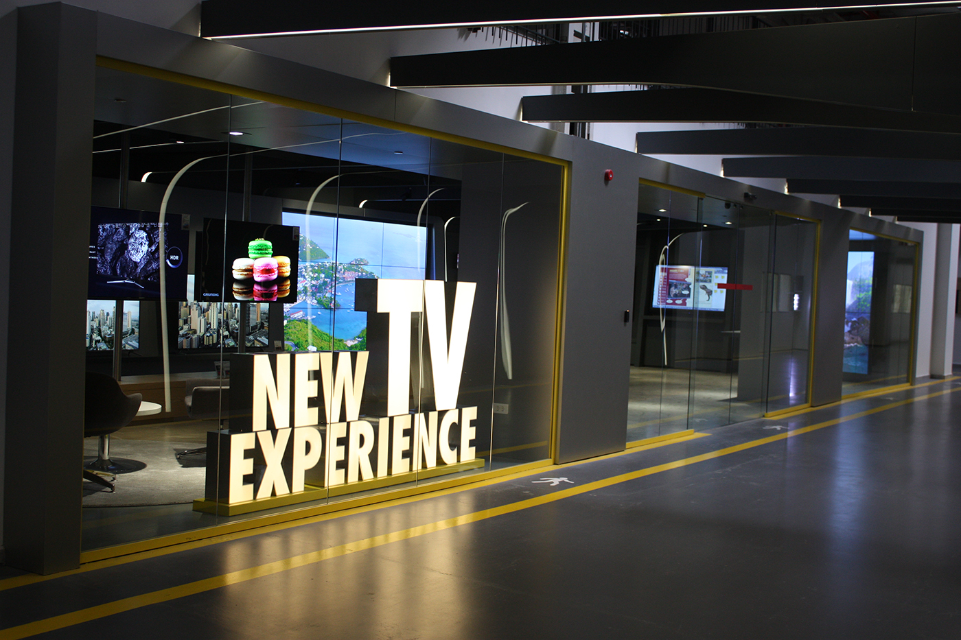
Design concept started with the brand’s identity and product research, as a result we found out that color use in the space will be tricky. So we decided to use a color that is opposite of the each brands identity color in color wheel which is yellow. This color will represent a dynamic, fast production of the factory which is compatible with the colors of machines and signs used in the space. Entrance area is highlighted with a frame that comes forward and supported with a grid system that is shaped in arc forms. These arc grids are started from corridor area and enters into showroom in one piece. Arc grids defines the showroom space and separates it from the corridor area. Arcs are also functioning as lighting fixtures which are all dimmed to enable different light use during the screen tests.
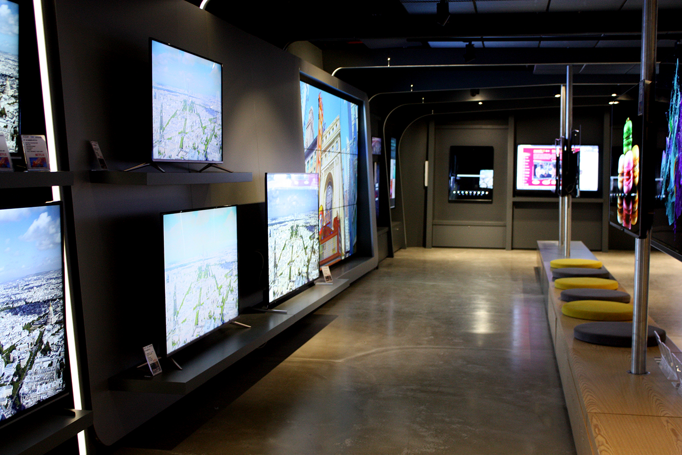
Showroom walls are designed as tv displays which are adaptable to different sizes. B2B and consumer products are categorized inside the showroom. Hero products are highlighted with different backround materials such as wood and stainless steel. Lounge area for informal meetings and bench area for screen tests are also located. Motorized rotating bars are designed in order to have a dynamic, living atmosphere. TV’s are displayed on these bars are revolves and enables to see the screens from different angles. A private test room is also located inside the showroom which will have a hidden entrance for new tv series and technologies.
